

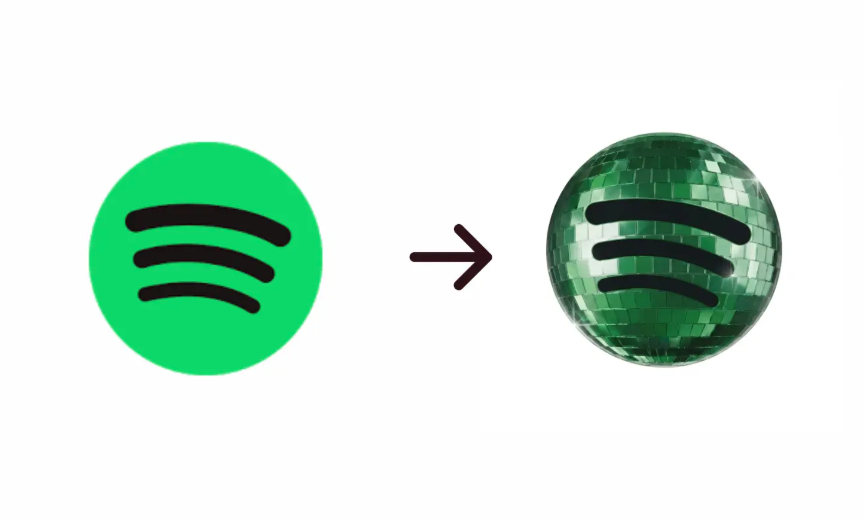
Spotify sparked widespread discussion online after temporarily replacing its iconic green circular logo with a reflective 3D disco-ball inspired icon on May 13, 2026. The sudden visual shift generated strong reactions across social media platforms, with many users questioning whether the company was undergoing a permanent rebrand.
The temporary redesign represented a major departure from Spotify’s long-established minimalist identity. For years, the platform has maintained one of the most recognizable digital brand icons globally, relying on a flat green circle combined with black soundwave lines. The updated version introduced metallic textures, reflective lighting effects, and a retro-inspired aesthetic associated with disco culture.
From a branding perspective, the change highlighted the growing importance of short-term digital campaigns designed to drive engagement rather than permanently alter corporate identity. Temporary app icon changes have increasingly become part of marketing strategies among major technology companies seeking to create viral conversations and increase visibility across social platforms. In Spotify’s case, the strategy succeeded in generating immediate attention.
Online discussions surrounding the logo surged significantly within hours of the rollout. Social media mentions related to the Spotify logo reportedly increased by more than 300% compared to average daily brand-related discussions during the previous week. Searches associated with terms such as “Spotify new logo,” “Spotify disco icon,” and “Spotify app update” also recorded sharp spikes across search platforms.


Despite the increased engagement, user sentiment remained divided. A notable portion of users expressed dissatisfaction with the redesign, particularly criticizing reduced visual simplicity and difficulty locating the application on mobile home screens. Others viewed the move as a creative and nostalgic marketing tactic aligned with music culture trends.
The reaction demonstrates the balance digital companies must maintain between innovation and brand consistency. Large technology platforms often rely heavily on visual familiarity to maintain seamless user experiences. Even relatively small interface adjustments can produce outsized consumer reactions because users interact with these platforms daily.
The temporary nature of the redesign also suggests Spotify aimed to create a scarcity-driven engagement cycle. Short-lived branding experiments can encourage online discussion because audiences perceive the change as unusual and time-sensitive. This approach has become increasingly common in the digital entertainment sector, where attention metrics and viral visibility directly influence platform relevance.
From a market positioning standpoint, the campaign reinforced Spotify’s identity as a culturally adaptive entertainment brand rather than a static technology platform. The company has historically tied its marketing strategies to music trends, artist collaborations, and pop culture moments. The disco-themed icon aligned with broader retro aesthetics currently gaining traction across fashion, music, and digital media spaces.
The incident also reflected the growing influence of social media communities in shaping public perception of corporate decisions. Within hours, memes, reaction posts, and commentary amplified the visibility of the logo change far beyond Spotify’s existing user base. While some criticism emerged, the overall campaign achieved one of the key objectives of modern digital marketing: sustained public attention.
Although the disco-ball logo was temporary, the reaction surrounding the May 13, 2026 update demonstrated how even minor visual changes by major digital platforms can generate significant cultural and commercial discussion.